


Edit: Once again my font size seems to change without any prompting from me!
Lesson 6:
I have thrown the word “collage” around for several weeks, and now realize I have not explained what it is. The word collage comes from the French verb "coller," meaning "to paste." When you make a collage, photographs, news clippings, book pages, old receipts, handmade paper, magazine images, or other objects are pasted on the substrate and may be combined with painted areas. These objects may be selected for their association with your chosen page/book theme, or for the textural qualities that relate to your subject matter. This technique was first accepted as a legitimate medium that could be substituted for painting in the fine arts category first introduced in the 20th century. One of the first examples was by Pablo Picasso.
A collage contains a composition, which can be good or bad. That means a composition is an orderly arrangement of elements using the principles of design. And of course those principles of design help you to carefully plan and organize the design elements so that your collage will hold interest and command attention. This is sometimes referred to as "visual impact."
I hope I helped clear up any questions you might have had along these lines.
Next, I want to explain that the examples I show are NOT fine art, or even great altered book fodder. Later, when we get into designing REAL pages, I will concentrate on making these pages (and the ones I will make later in this course) look better and more like what you would expect from a genuine AB spread. Right now, all I am trying to do is give you the bare bones basics, so you can go from there. And for those of you who are struggling, PLEASE don't be discouraged. It will come together soon enough, and you will soon be making AB pages far better than anything I can show you. After all, some of you already are!
Now lets get on with the lesson.
In the last lesson, I said we would study Repetition, Rhythm, Pattern, Movement, and Contrast this week. I made a typing mistake, which should have read:
Repetition, Rhythm OR Pattern, Movement, Dominance, and Contrast.
And since I believe these are all words you can associate with a concept, I believe this lesson will be easier than the last one.
RHYTHM
Rhythm and pattern are basically the same terms for the movement or variation characterized by the regular recurrence of different quantities or conditions. In simpler words, it's a pattern and shows that the design has a 'beat' or 'flow' to it. A plain white box has almost no rhythm. Rhythm is also a movement in which some elements recur regularly. Images will have a flow that will add to, not take away from, the overall design. It is most closely associated with music, although it is one of the design principles of your collage.

We probably all know what pattern is. The pattern that comes to mind for me, is plaid. For some reason, plaid says rhythm. I tried to replicate it in this spread I made using two bingo marker dye dabbers (much cheaper than Ranger dabbers) and a Wilton cookie cutter.
MOVEMENT
Movement is the path our eyes follow when we look at any art, whether it is collage or a painting. The purpose of movement is to create unity in the artwork with eye travel. This can be achieved by using repetition or rhythm. Movement ties the collage together by relating the various components of the collage together.
By arranging the composition elements in a certain way, you control and force the movement of the viewer's eyes in and around the composition. For example, the eye will travel along an actual path such as a solid or dotted line, or it will move along more subtle paths such as from large elements to tiny elements, from dark elements to lighter elements, from color to non color, from unusual shapes to usual shapes, etc. Repeating a size or shape will also lead the eye in the path you want the viewer’s eye to travel.
Using repetition to create movement occurs when elements which have something in common are repeated regularly which could create a visual rhythm. Repetition doesn't always mean exact duplication either, but it does mean similarity or near-likeness. Actually, slight variations to a simple repetition will add interest. Repetition tends to tie things together whether they are touching or not, which means it is an easy way to achieve unity, too. Add to that, the concept that a line may vary in length, weight, or direction. Color may also be repeated in various parts of the composition in order to unify the various areas of the collage.
Movement can also be created by action. Although we may include some three-dimensional embellishments, for the most part, our book pages are two-dimensional. In this form of art, action must be implied. Implied action creates life and activity within the composition. This is best illustrated by the direction the eye takes along an invisible path created by an arrow, a gaze, or a pointing finger, as in the piece I made for my Hands AB that I show at the end of this lesson. Action can also be indicated by the "freeze frame" effect of an object in motion, such as a bouncing ball suspended in mid air, a jogger about to take that next step,
 or a rocking horse taking a dive. Note also the direction of the background changes (horizontal and vertical) which is a characteristic of contrast, a design principle we will study in a few moments.
REPETITION
I believe everyone probably knows that repetition means something that repeats. Repetition with a bit of variation is interesting. Without variation, repetition can become monotonous. When variation is introduced, you create interest. That means any repeating element should include a degree of variation.
 There is not much variation in this spread in my techniques book I call "Row Houses."
 And although there is little variation, the colors in this piece help make it appear more varied.
CONTRAST
Contrast is the juxtaposition of opposing elements. They can be opposite colors on the color wheel (like red and green), or they can be light and dark. Likewise, they can be a contrast in direction, such as horizontal and vertical. The greater the difference, the greater the contrast.
The major contrast in your collage should be located at the center of interest. Too much contrast scattered throughout the collage can destroy unity and make a work difficult to look at. Unless a feeling of chaos and confusion are what you are seeking, it is a good idea to carefully consider where to place your areas of maximum contrast.
The key to working with contrast is to make sure the differences are obvious. The most common ways of creating contrast are by creating differences in one or more of the design elements, such as shape, color, line, texture, size, or alignment, to name a few.
 Note the contrast in this set of row houses. The contrasting one also has a door that opens differently than the others.
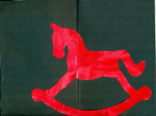 Although this isn't black and white, the contrast is still evident in this red rocker!
We’ve often seen works that make us uncomfortable. Contrast often plays a big part in that. And that leads us to our final Design Principle.
DOMINANCE
Dominance gives a collage or AB page interest, counteracting confusion and monotony. Dominance can be applied to one or more of the Design Elements to give emphasis. Ask yourself what sticks out and first catches your eye. Chances are, it will be the prominent elements or shapes you have placed on your page.
 Note how the tree dominates the scene in the above page. It shows perspective and is the element the eye sees first.
Now that you have been exposed to all the Design Principles, look at the spread below that I made for my "Hands" AB.
 See if you can identify a few of the Design Principles I used in this lesson.
Review
Rhythm or pattern: An element, such as the background that creates a recognizable visual pattern and interest.
Movement: The suggestion or illusion of motion.
Repetition: Repeating similar elements.
Contrast: The main element is different in some way, causing it to stand out.
Dominance: The prominent elements or shapes stick out. This often works in connection with perspective.
Now that we have learned the design principles, we are ready to explore the design elements in our next lesson.
Using The Design Principles
This study of the design principles would not be complete without giving some practical guidelines on the use of the principles of design.
1. Apply the principles in every spread, either consciously or subconsciously. Many of us use these principles subconsciously because they are often not something we consider when starting our pages.
2. Don't apply the principles equally, because one may be more important than another depending on the mood and purpose of the design. One design may be strong in balance, another in proportion, another in movement, and so on.
3. Try to include as many, and as much as will work, of each principle into each of your spreads.
4. You, as the designer of your spreads, should always add a bit of your own personality into your pages. Without this touch, your work may be well designed, but lack character.
5. As you become more self confident, then you should dare to violate one or more of the principles of design to promote growth in your creativity. Remember, great artists (and even a few not so great ones) OFTEN break the rules of these principles.
6. Once you have an objective in mind, the effective use of the design principles of balance, movement, emphasis, contrast, proportion, rhythm, harmony, and dominance will aid in the achievement of unity in your art (and YES, altered books are art!). Whether you use the principles consciously or subconsciously, unity, the very first principle you learned, should always be the ultimate goal.
Homework for Lesson 6
Using your book’s theme, create at least one spread each showing your interpretation of repetition, rhythm or pattern, movement, dominance, and contrast. If your book is a techniques book, you should identify and document what each Design Principle is. If you have lots of pages in your book, feel free to create several spreads showing your knowledge of these Design Principles. Combining more than one Principle will be considered an added bonus. You have two weeks to create these five spreads. We will unveil our results on April 29.
Supplies you will need for Lesson 7
1. Papers from your stash to compliment your theme.
2. Embellishments from your stash to compliment your theme.
3. Paint from your stash to compliment your theme.
4. Magazine images from your stash to compliment your theme.
5. A good pen or pencil.
6. Glue, adhesives, your favorites.
7. Your book.
You might want to start saving magazines, since we will use them in Lesson 8 and several lessons after that.
Now it’s time to show us your interpretation of Lesson 5, where you played with harmony, unity, balance, proportion, and emphasis. Please remember to show your homework lesson when I ask for it. You have two weeks to post Lesson 5, but I suspect many of you are ready. And please be sure the link is to the specific post or posts, not to your blog in general.
You may also post ANY previous lesson here, too. Just add the lesson number after your name, not your blog post.


21 thoughtful remarks:
As usual, you do a great job explaining everything, even though my eyes crossed a few times and my attention span wanned and I lept ahead to the end! lol Sorry, but it usually takes about 2 to 3 reads for me to get it all under control, I am the worst aren't I? But I am so enjoying the process of learning, even reviewing basic composistion is fun when you get to spread paint and glue around! :o waving hi from the hills of North Carolina :)
Wonderful tutorial! So well done! These design principles apply to photography too!
Thanks Elizabeth for a very clear and easily understood explanation. Must admit I found lesson 5 a little more involved as it was all new to me. Have had a go at a spread though and will link later when I put it on my blog.
Just added my link to lesson 5 although some might have seen it already as it was my WOYWW#148 entry too. Having to combine all principals on one spread so I don't run out of pages in my small book. Thanks for the "collage" description, I needed that. BJ
Update - blog updated and link added.
Lesson 5 has been linked! It takes me awhile to get started on each lesson until I build up some confidence. At least, I am starting to like what I am creating! Thank you again for these wonderful explanations and all the time you so generously give. Hope you are safe from the tornadoes.
As usual, another great lesson in elements of collage and principles of design. I like the very precise yet thorough lessons you give. Thanks so much Elizabeth.
I'm loving this, Elizabeth, but so far have just removed pages and reserved the block at the back to cut my niche.
I've put two layers of Daniel Smith watercolor ground on the front cover and am patiently waiting for it to dry before I continue. I have spent time going through magazines collecting words and images related to my Fruits and Nuts theme.
I will definitely link up when I have something to share,
xoxo
Yes, I agree. This takes a few times of reading. Thanks for the clarity though. I shall polish my post on lesson 5 and then be back to link up. I counted pages and lessons and thanks for the go ahead to return to these pages and make them better as our skills increase. I already cut one page out to make a 'tip in' but will be using that also ran page somewhere! It is all fun!!!
My favorite page is the tumbling rocking horses. It is so appearent that you put a lot of work and research into each lesson. As said earlier, this info applies to any type of art not just altered books.
Darla
I like the tumbling rocking horses too, a perfect way to show movement. Thank you again for your clear instructions Elizabeth. I have linked up my lesson 5 for you now xxx
VERY cool post- I love the way you illustrated each term, making it very easy to follow. I may have to borrow some of this for my classes; I've been wanting to put together a collage and mixed media project and you're really inspiring me here! Thanks!
You knock my socks off with this. I've started out most every Kickin' Arts session this school year with a very similar explanation of what Collage is.
I loved that your clear and simple discussion of this and the other elements are so accessible, that even if [or when, as I pretty much think we ALL get overwhelmed when learning, even those of us who love learning like it is water, when in a new beam of it...] we're feeling that WHOA!! thing that sometimes comes.
I am still standing on the sidelines and as I have come to know this as my way sometimes, I am glad to have the peeks at others' progress and interpretations.
This is simply amazing.
p.s. thank you, too, for the nice things you said on my 366 Daze of Grace. I wrote back to you all who have commented today, and since I don't know any way of getting the message to you, I hope you might pop back and read it. you have made my Monday twice already and it's only a little after noon!!
Only managed to do one double page spread for the last lesson! :( Hey ho... hopefully I'll be able to sit down in peace and quiet and be able to concentrate on this lesson!
Thanks for the lovel comments on my last two pages for part 4. They are very much appreciated!
Jackie x
oh dear i've only just finished lesson 4. I am really going to have to get a move on, but all that reading makes my eyes cross.... sorry! you are so thorough, especially with the design elements. It takes me a couple of times to take it all in. I will get it done, maybe tomorrow.... maybe :)
janet
Squeezed in another double page spread today! :D Quite pleased with this one!!
Jackie x
Again, you have shown your ideas so well with the examples! Thanks for making it so clear!
oh dear.... oh dear... I haven't managed to make one acceptable page from the last lesson and here I am faced with another trauma... my head isn't with it... I hate to make messes in my nice book... and yes, they are messes!! I think the stress of having the house upside down and the carpets being ripped out next week is not helping... so I apologise... I am leaving a basket of stuff out with my AB and as soon as the house is straight again I will be able to sit and take all this in... I think!!
A really great lesson this one and you are right, it WAS much easier! Whether that waqs down to the fact that I was 'warmed up' I'm not sure!
Anyway, that's me up to date so i can take a wee break untill next time.
Thanks for all your hard work,
Jackie x
Hello Elizabeth, just saw mention of your altered book tutorial on Sherry's blog and immediately knew this was something for me to join in. Sorry I am so late but I will catch up if you are ok with such a late arrival. Thanks for the tutorials and been peeking at other people's work, some fantastic beginnings here.
Here are my lessons 5,6,7 combined
http://paperartteam.blogspot.com/2012/05/more-altered-book.html
Post a Comment